Tuesday, June 24, 2014

"Never Gets Easy, Does It?"

"Never gets easy, does it?" was exactly what I needed to hear, from Terry.  It's nearly impossible to imagine this is hard for Terry, or Sorolla!  That really is the point I need to soak up; it will always be hard.  As the manager of the World Series runner-up Rockford Peaches once declared, "It's the hard that makes it great."  Good, I am right where I am supposed to be.


Results Show!
(As always brought to you in a retelling of Terry Miura's latest notes on my prior posted studies)
I haven't re-posted the previous studies in the past, but I will today so the comments are more useful.

As for the Dogs, high five!

He thought they looked great.  In future pet portraits I need to more carefully consider the role of the background.  I need to ask myself just how much of the background is important in providing context for the dog's position in the environment, being careful not to over-describe.


As for the President Elect in 1909, there are a few more suggestions.


Mr. Taft's saturation was mostly under control except for the red streak on his right cheek.  The study had good vertical value change without being overworked.  However, in an interior tonal painting the darks of a dark background need to be transparent in order for it to recede.  (One can see the transparent dark under his lit ear looks better than the other opaque side).  To accomplish this, a bigger brush would be useful.  The black outlining his mustache was a drawing relic that should have found itself painted over, as it flattens the shape of his facial hair.

Finally, he appreciated the attention paid to the variances of soft edges, but calls me out for not using a loaded brush.  The strokes where the outside edges meet the background look timid because the paint is too thin.  He in includes the perfect Sargent recommendation for this, "Paint one shape into another."  Terry explains it requires a "confident, intentional, loaded brush" to "achieve buttery soft edges" then adds, "Don't expect to get it right on the first try".  This is the error I make when I'm getting tired, ignoring that my palate needs cleaning, and carelessly grabbing a little from whatever piles happen to cover the glass.  This is a desperation move like taking a lazy shortcut which ends up costing double.  The fix for my timid strokes must be addressed on my palate first, and then I can move on with light pressure and intentional direction of the brush.  When this fails, there is always the trusty 'undo button' (the palate knife) for a scrape and round two.


The latest studies!

Study of Sorolla's Juliana
1 hour


Self Crit

That shadow mass does not read as a mass.   It has too much variation of value and temperature including the reflected light by her left eye, which is too light.  Her hair knows what I am talking about.  The brown outline tracing her jaw from her left ear is too dark, too brown, and too hard of an edge.  Should have gone for the knife.  The dark line on the inside corner of her left eye is also too dark and cool, unless she was recently wounded.  I am not feeling the 'big sculpt'.  Perhaps we can call this a warm up?


I spent more time on the next…

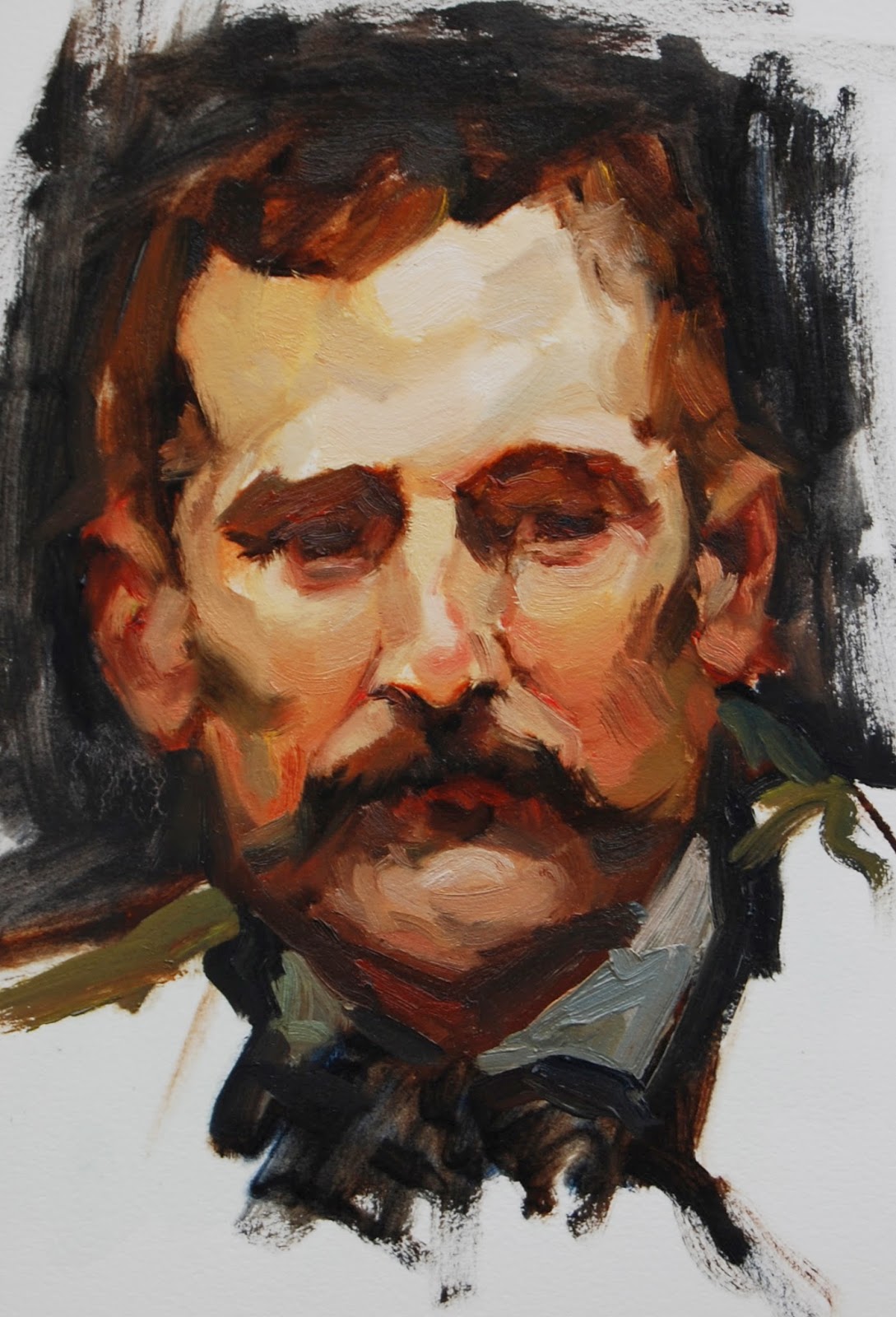
Study of a 1909 Sorolla Selfie
1.5 hours


I was feeling like a failure at the end of this, but looking at it now, I like it!  I was really trying to keep the background translucent, and then I contaminated my stroke with opaque flesh to his right.  Like Mr. Bean I tried to blend it in to cover my tracks, which worked about as good as any Mr. Bean cover up.  It was too late, and very difficult to scrape it off the paper.  I see another miss hit in his nose highlight.  With the white too large and too far south I have flattened what ought to feel like the ball of his nose.  The reflected light in the shadows of his forehead and cheek may be too light.  Although I loved laying in that stroke which is meant to be his side burn, it more closely resembles a strap keeping his hat from becoming the victim of a blustery gust.  The facial hair here seems to turn the form better than some have in the past.  I used much more medium (liquin) for this one and I think it really helped.  


And even longer on the last…


These two have caught on to the 20 min mandatory breaks.  They're pretty sure it's about them.


Study of Sorolla's Elena
~ time?  Really not sure 2-2.5 hours until USA game time


First thing I did this morning was clean my turp (technically odorless mineral spirits) and top it off.  It was trashed with pigment!  Oops, so refreshing to start this one though.  I'm going to call a drawing error.  No, I swear her mouth was NEARLY that small in the original, but her eyes were not that far apart.  Or maybe, it's that I lost the cool and darkness of the stroke that is meant to define the inside corner of her right glabellum as it turns down into her nose, in reworking it.  Actually, I think it's that her eye doesn't recede in the socket as a result.  Let's go with that for now.  

I tried to pay close attention to the soft edges along the right of her jaw.  Just above these I really liked the graphic light contrast as her fair face met black hair, and couldn't bring myself to soften them.  Painting them hard edged seemed cool at the time.  Now it seems like cheating.  I also regret redrawing the right of her chin with that broad stroke.  The outline is too thick to turn the form.  

I hadn't painted in a while when I started with that first study.  It really helped to paint the other two back to back!  So glad I see progress in this set.


NEWS!

This week I made a big decision!  In order to make more of a go at this, I asked my manager to cut back my schedule next year.  This is my idea of a taking risk, a little plunge.  I am so excited!  And a little scared.

Thanks for coming!


Thursday, May 29, 2014

Getting Back To Work

My latest trip to the gym felt a lot like my latest painting homework.  Where yesterday's kettle bell swings seemed to collect interest on previous fun had in Cabo, this study of Sorolla's Portrait of Taft had a way of exacting a late penalty of its own.  It's been an awesome whirlwind since Sugar Shack went up.  After a dog portrait, a Terry class, a couple weekends away, and a day's worth of laundry wrapped up, I felt the accumulation of time elapsed between head studies.   My focus was challenged.  Sorolla's seductive brushwork and masterful expressions continue to distract me from getting the big sculpt right.

I started off mentally chanting, "Less saturation in the reds, lighter darks, and less pressure on the brush."  At first I actually had a really nice subtle warm to cool change down the red length of his right cheek.  But in the end, with the hour timer going off (and off and off, for at least an additional 20 min of overtime), I carelessly picked up an unintentional color from my palate darkening and saturating it too far again!  I did try to keep the big sculpt in mind when I tackled his mustache, darkening and cooling it more in the shadow side, though it still seems flat to me.  

I really struggled with his brow; there was such a significant plane change under that frontal plane above the brow ridge.  I never quite figured out how best to handle the left side of his forehead either, especially with it right up against reflected light in the shadow.  The stroke describing the smile line off his right nostril seems too dark and too brown, while the stroke bellow and to the left side of his lip seems too light.  At least it's flat, and I am wondering if it is the value that is to blame.  Despite feeling out of shape, this 'Portrait of Mr. Taft' was a really fun painting to explore.  I love the expression on his face!  Good one Sorolla.   


Since the last post, it hasn't all been travel adventure!

A very thoughtful and dear friend commissioned a portrait of their dog Bo.  With his tail wagging like an airplane prop, this mature Basset Hound-Rhodesian Ridgeback is irresistible.  Of course he needs a portrait!

'Bo'
8x8" Oil on Panel


My work will be up at Sugar Shack for a couple more weeks if you're near the grid.

Now, lets beef this post up with a few more dog portraits!


'Roxanne's Westies'
9x12" Oil on Panel


'Atticus'
8x8" Oil on Panel


"Abby"
8x8" Oil On Panel


Monday, May 5, 2014

Sugar Shack Show

The Sugar Shack Show is up and the results from my latest homework are in!

First the results show...

Terry had some great notes on my Vicente study, and ya'll might notice there are some trends.  Points were awarded for a tighter color harmony although I need to pull back on the reds.  I tend to loose the value structure when I push saturation.  Sounds familiar right?  Terry explains the difference between a 'tonalist' process (including Sorolla, the artist I've been referencing), and a 'colorist' process.  "In a tonal approach, you are increasing saturation to get a target color, where as in a colorist (impressionist) approach, you're graying down a saturated color to get the target color."  For these studies, I need to start with a muted theme color and approach it like a monochromatic painting, with subtler hue and temperature changes.  In this way, I keep color theme in check so that the 'big sculpt' is effective, saving the few color accents towards the end.  The beard was also a fail on the ‘sculpt’ as I lost the shape of the muzzle due to poor value organization.  I am going to need more reps.  I've heard it takes ten thousand hours to become an expert.  
This could be the beginning of a long running blog.  

He liked the shoe!  While he thought the colors were nice and clean, and the values well organized, he suggested that the toned yellow canvas showing through in the background was unnecessary in this particular case.  Leaving canvas exposed is not an error per se, but as it didn't 'support the concept' this time, I opaqued over it.   Yeah, I got that bit of advice after the canvas-exposing overdose on the following painting, "Warming Up". 
Also trending, "Less pressure on the brush".


 The Sugar Shack Show!


Several armfuls of paintings hit a very cute Midtown Boutique on Friday!


A sample of the latest~


'Fave Pump' 
8x8"
(post changes to background)


"Warming Up"
6x6"


"You Win, You Always Do"
9x12"


The cocktail ring, modeling in the staring contest versus the Nalgene bottle, is actually from their sister boutique Krazy Mary's.  I got a little sucked into the details on that last one. 

Now, back to my top-secret dog commission!


Monday, April 21, 2014

Hue Family Practice

Man, am I feeling more balanced.  After a couple weeks in the high intensity range of life, I am grateful to have made some space to catch up on my spreadsheets, go through the junk drawer, and paint!  Yesterday morning I made tea and spent yet another second missing the chance to be on the beach with my boyfriend this weekend, and then an additional moment wishing I was headed to the Badminton flush Easter dinner at my friends house, before getting back to work.  A session or two later when the gal at my favorite Indian Food spot, Bombay, asked me how many people I was ordering delivery for, I would only divulge that I wanted three sides of rice so there were leftovers.  It was a ton of food for one.  

Before getting to my head study homework I had to finish this still life for Sugar Shack, the shop I am hanging at in a couple weeks.  


'Fave Heel'
8x8"


Onto Hue Family Practice!  
The point that stuck with me the most from my last crit was that color family bit.  For this study I tried to keep this in mind and not push the light-dark value range AND the warm-cool too much at the same time.  This was done from Sorolla's Portrait of Vicente Blasco Ibanez… In just two hours I may have added 10 pounds.


The values get a little lost in the beard, but the lights aren't bad.  The light note on the bridge of the nose is too light, too big, and has too hard of an edge.  The tones as the forehead turns towards shadow are too cool, as well as the dark green note of the beard in the light side.  His right lower lip has a touch of cool that makes me want to run for the oxygen tank, but the value is pretty close to correct.  I really like the cool notes as his stubble bends back toward his right ear; I wonder if they are warm enough?

Its funny to see these two studies juxtaposed; I wasn't thinking about any of this when I painted the red pump.  It makes big temperature jumps.  Did I keep the values close enough?

Stay tuned for results show.


Saturday, April 5, 2014

All in the Family

After drawing class Thursday morning, I was pumped and a little art-intoxicated as I lunched in the car en route to the dental office.  I was only able to attend 3 of about 12 classes during the first three month section, and poppin in for the last class I saw in the way of a time lapse how much everyone else improved!  It gave me hope!  And then gave me a swift kick in the pants.  


Sigh.
I was feeling left in the dust.
Thanks Mila the Cat for helping me feel through the blog this morning, perfect timing.
I have simply got to find a way to make more time for this… Working on it!

Regarding my last exercise, Benito round 4, Terry's crit commended some progress in realizing depth and awareness of the 'big sculpt', for which I was relived to hear.  The major issue with it was that I tried to push the depth a little too far and made the darks too dark.   Terry lays it out, "One of the fundamental rules of representational light and shadow relationships is that between light and shadow of a shared surface, you can have a big value jump or you can have a big color jump (temperature shift), but you can't have both."  So I made a big value jump but did not keep the light and shadow colors in the 'same hue family'.  I remember reading this excited to take it into the next study, and then I stepped back and looked at the result of that next study.  I may have done it again.  


Study of Sorolla's Santiago


(in progress)


About 1.5 hours later

The forehead is convincingly sculpted, but temporal shadow describing the left edge seems flat like a crack in the clock tower with the bit of light behind it too light and not falling back.  While the ears feel like they are pushed back, there is no feeling of side planes curving back to meet them and the nose is not popping.  So, this must mean the edges of the nose are too hard.  The eye sockets seem to have light on the upper lids where they should be in shadow.  In an attempt to redraw the mouth I got the darks too cool again!  From the in progress pic it looks like I started with barely a value difference between light and dark, and then I must have over compensated.  The shadow along his left side is a big value jump to the 'too dark side' and possibly too cool as well.  Sometimes I feel like I am taking a step back in results but there is definitely much more happening in my head!  This is definitely going to pay off!  Some day.

Wednesday, March 26, 2014

Edge Control & NO Time Limits!

Nothing strikes more fear into my heart than hearing, "I think we need to try one without the hour time limit…"  Sure I haven't beat the clock once, and yeah, its forced me to make choices faster than I can comfortably handle, but now there is no bell to save me!  How will I keep from overworking it and beating it to death?  How many times will I fix the wrong thing and wind up dragging new strokes over the terrain of the old dry ones like I am petting a cat the wrong way?  When will it end and how can it possibly end well?

Though the first line of his instructions had me panicked, Terry reassures me before signing off, "You may end up noodling and overworking, but let's not worry about that too much this round."  Ok, so thats a given, phew.  But between this promising to be exceptionally hard, and the first rounds of March Madness tipping off, I had more than enough fuel for procrastination.  Somehow I managed to grab the highlighter off of my NCAA bracket (I can't help but print it and grade it the old fashioned way) and review the keys to this assignment:


Edge Control

•Soft edges where the form turns
•Vary the softness depending on how quick the form turns; tighter radius = sharper edge
•Figure out stroke direction of foreshortened shapes (sharp edges are counter to foreshortening illusion)

Aslo Notable

•Paint light area physically on top of shadow
•Shadows should be subordinate to the light, less prominent
•Knock down the intense red of the underpainting w black or blue

And my favorite part

"Focus on creating hierarchy of depth from the tip of the nose to the background by paying more attention to edge control that you have ever done in your life!"

Good one Terry

This was really hard.  I have all kinds of room for growth in edge control.  I literally let this painting dry  several times and had to liquin back into it to continue working.  I am not sure that any of the last few hours really improved the situation either.  I mixed the brown and blue together to knock the red out of the underpainting, but the drawing was still to heavy handed.  A very bad sign when the assignment is edge control.  Isn't that essentially brush control?  Shouldn't the drawing be the easiest place to get that right?  Uhoh.

This time I made sure to keep the Assaro 'planes of the head' model near for reference.  The simplified head is very helpful in translating Sorolla's work, and easier to see than the small image in my book.  In all honesty, I didn't decide I was done because I stepped back and saw at last a superb product, but rather because it felt like I was beating a dead horse.  


Here is the iphone in-progress play by play


Thrown in the towel
Benito 4


Looks like the stroke describing the inside corner of his left eye cuts to far or to sharply into the iris- pretty wonky.  The dark wrinkle extending laterally from his left eye also seems too sharp.  The chin feels too flat, as well as the hair line.  I don't feel the recessed depth of the brow ridge either.  At least his nose feels like its popping out.  I feel like I have a long way to go on edges.  Maybe its time to put the head away for awhile and take out an orange!


Comparison of Benito 3 (from last assignment) & Benito 4


Here's to growth!


Friday, March 14, 2014

Comin' From Behind

"I'll give up the gym and dating!" 

Yep, my dramatic proclamation to Terry at our first meeting was a bit much.

(And then I met a boy!)

Coming from behind in more ways than one, I continue my pursuit of mastering fundamentals whilst simultaneously catching up on my study quota.  Luckily I prefer to act the underdog, the 12th seed over the 5th, rooting for the Bad News Bears.  And in this case climbing out from a significant master study deficit!  After an awesome surprise trip to Vegas with my amazing new boyfriend (Yay!), I have spent this past week recovering from a lack of sleep and checking boxes off my list.  The Golden Bear show came down with no bar casualties, and coincidentally made several happy new Lenefsky collectors.  Now, back to Sorolla heads!


The focus of these was to remember the head is first of all a head and not unlike an egg.  Before getting lost in the eyes or nose, the first goal is to depict the form which rounds both horizontally and vertically.  In the last few studies I was a hot mess.  Mistakes such as tripping over the texture of the paper, picking up way too much paint, pushing the brush too hard, and most costly, not mixing puddles or observing this value structure lead to flea ridden results.

I began the next few studies with a light Liquin coat, a medium to help smooth the flow of paint across the surface.  I also did not move past the drawing until I picked up my palate knife and made a pile each of light and shadow color.  I then attempted to stay focused and mixed all subsequent notes from either puddle in attempt to maintain the value structure.  


1hr Sorolla Study #10

Yep.  This is the third time I have painted this head!


Of my three Benito Perez Galdos efforts, this is the most successful.  I stuck with a bigger brush for a longer period of time and used a little medium in order to make fewer, larger passes.  Having premixed the puddles, this was also much easier to organize!   The light planes under his nose do not seem to compete with the forehead's lightest light as they did previously.  The ears however, are a bit Mr Potato Head-esq, sticking out with out falling back behind the face.  I lost the drawing and failed to define where they meet the side of head.  The nose seems like an umbrella, opening up over the philtrum and not rounding back down under the plane.  Still, finally looking better!


1hr Sorolla Study #11


For this study I referenced my full color Sorolla book and the plate Portrait of Jose Artal.  I'm feeling the volume of his forehead a bit here, but could have paid more attention to the brow ridge.   The light looks like a white box tattoo and doesn't describe the shape.   I am really not loving the nose here either,  as it is not convincingly sculpted.  The light notes in the beard are too light.  The puddles did seem to help with the organization, however I think I spent too much time on the wrong things.  Namely, in trying to describe the eyes in shadow, I reworked them several times to the detriment of the other features.  And in the last moments scrambled to fill in the flesh elsewhere.  

In round two of Jose, I closed the book and referenced a digital black and white image of the same painting along with my first Jose (#11).


1 hr Sorolla Studies #11 and #12


In terms of color I prefer Jose #12 overall, though the left side of his head does not round back into space as well.  Unfortunately, I managed to run out of time before he had a left ear but it seems roughly in at the right depth.  Hmm... can't wait to hear what Terry says!