Wednesday, March 26, 2014

Edge Control & NO Time Limits!

Nothing strikes more fear into my heart than hearing, "I think we need to try one without the hour time limit…"  Sure I haven't beat the clock once, and yeah, its forced me to make choices faster than I can comfortably handle, but now there is no bell to save me!  How will I keep from overworking it and beating it to death?  How many times will I fix the wrong thing and wind up dragging new strokes over the terrain of the old dry ones like I am petting a cat the wrong way?  When will it end and how can it possibly end well?

Though the first line of his instructions had me panicked, Terry reassures me before signing off, "You may end up noodling and overworking, but let's not worry about that too much this round."  Ok, so thats a given, phew.  But between this promising to be exceptionally hard, and the first rounds of March Madness tipping off, I had more than enough fuel for procrastination.  Somehow I managed to grab the highlighter off of my NCAA bracket (I can't help but print it and grade it the old fashioned way) and review the keys to this assignment:


Edge Control

•Soft edges where the form turns
•Vary the softness depending on how quick the form turns; tighter radius = sharper edge
•Figure out stroke direction of foreshortened shapes (sharp edges are counter to foreshortening illusion)

Aslo Notable

•Paint light area physically on top of shadow
•Shadows should be subordinate to the light, less prominent
•Knock down the intense red of the underpainting w black or blue

And my favorite part

"Focus on creating hierarchy of depth from the tip of the nose to the background by paying more attention to edge control that you have ever done in your life!"

Good one Terry

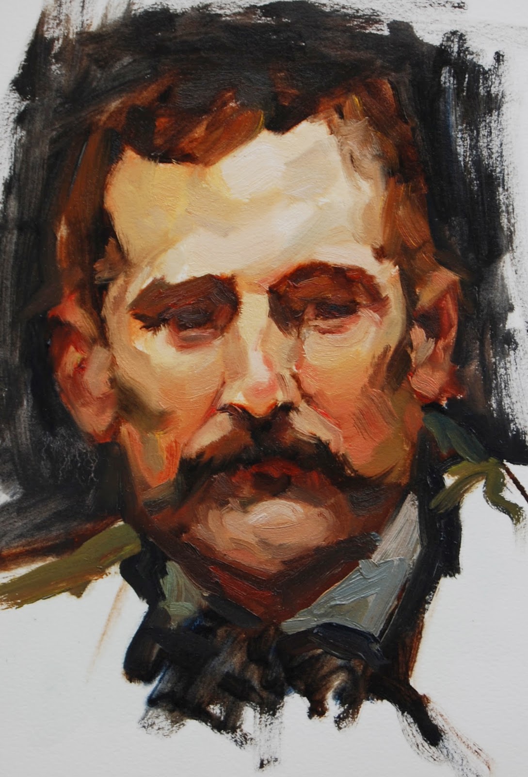
This was really hard.  I have all kinds of room for growth in edge control.  I literally let this painting dry  several times and had to liquin back into it to continue working.  I am not sure that any of the last few hours really improved the situation either.  I mixed the brown and blue together to knock the red out of the underpainting, but the drawing was still to heavy handed.  A very bad sign when the assignment is edge control.  Isn't that essentially brush control?  Shouldn't the drawing be the easiest place to get that right?  Uhoh.

This time I made sure to keep the Assaro 'planes of the head' model near for reference.  The simplified head is very helpful in translating Sorolla's work, and easier to see than the small image in my book.  In all honesty, I didn't decide I was done because I stepped back and saw at last a superb product, but rather because it felt like I was beating a dead horse.  


Here is the iphone in-progress play by play


Thrown in the towel
Benito 4


Looks like the stroke describing the inside corner of his left eye cuts to far or to sharply into the iris- pretty wonky.  The dark wrinkle extending laterally from his left eye also seems too sharp.  The chin feels too flat, as well as the hair line.  I don't feel the recessed depth of the brow ridge either.  At least his nose feels like its popping out.  I feel like I have a long way to go on edges.  Maybe its time to put the head away for awhile and take out an orange!


Comparison of Benito 3 (from last assignment) & Benito 4


Here's to growth!


Friday, March 14, 2014

Comin' From Behind

"I'll give up the gym and dating!" 

Yep, my dramatic proclamation to Terry at our first meeting was a bit much.

(And then I met a boy!)

Coming from behind in more ways than one, I continue my pursuit of mastering fundamentals whilst simultaneously catching up on my study quota.  Luckily I prefer to act the underdog, the 12th seed over the 5th, rooting for the Bad News Bears.  And in this case climbing out from a significant master study deficit!  After an awesome surprise trip to Vegas with my amazing new boyfriend (Yay!), I have spent this past week recovering from a lack of sleep and checking boxes off my list.  The Golden Bear show came down with no bar casualties, and coincidentally made several happy new Lenefsky collectors.  Now, back to Sorolla heads!


The focus of these was to remember the head is first of all a head and not unlike an egg.  Before getting lost in the eyes or nose, the first goal is to depict the form which rounds both horizontally and vertically.  In the last few studies I was a hot mess.  Mistakes such as tripping over the texture of the paper, picking up way too much paint, pushing the brush too hard, and most costly, not mixing puddles or observing this value structure lead to flea ridden results.

I began the next few studies with a light Liquin coat, a medium to help smooth the flow of paint across the surface.  I also did not move past the drawing until I picked up my palate knife and made a pile each of light and shadow color.  I then attempted to stay focused and mixed all subsequent notes from either puddle in attempt to maintain the value structure.  


1hr Sorolla Study #10

Yep.  This is the third time I have painted this head!


Of my three Benito Perez Galdos efforts, this is the most successful.  I stuck with a bigger brush for a longer period of time and used a little medium in order to make fewer, larger passes.  Having premixed the puddles, this was also much easier to organize!   The light planes under his nose do not seem to compete with the forehead's lightest light as they did previously.  The ears however, are a bit Mr Potato Head-esq, sticking out with out falling back behind the face.  I lost the drawing and failed to define where they meet the side of head.  The nose seems like an umbrella, opening up over the philtrum and not rounding back down under the plane.  Still, finally looking better!


1hr Sorolla Study #11


For this study I referenced my full color Sorolla book and the plate Portrait of Jose Artal.  I'm feeling the volume of his forehead a bit here, but could have paid more attention to the brow ridge.   The light looks like a white box tattoo and doesn't describe the shape.   I am really not loving the nose here either,  as it is not convincingly sculpted.  The light notes in the beard are too light.  The puddles did seem to help with the organization, however I think I spent too much time on the wrong things.  Namely, in trying to describe the eyes in shadow, I reworked them several times to the detriment of the other features.  And in the last moments scrambled to fill in the flesh elsewhere.  

In round two of Jose, I closed the book and referenced a digital black and white image of the same painting along with my first Jose (#11).


1 hr Sorolla Studies #11 and #12


In terms of color I prefer Jose #12 overall, though the left side of his head does not round back into space as well.  Unfortunately, I managed to run out of time before he had a left ear but it seems roughly in at the right depth.  Hmm... can't wait to hear what Terry says!