Monday, April 21, 2014

Hue Family Practice

Man, am I feeling more balanced.  After a couple weeks in the high intensity range of life, I am grateful to have made some space to catch up on my spreadsheets, go through the junk drawer, and paint!  Yesterday morning I made tea and spent yet another second missing the chance to be on the beach with my boyfriend this weekend, and then an additional moment wishing I was headed to the Badminton flush Easter dinner at my friends house, before getting back to work.  A session or two later when the gal at my favorite Indian Food spot, Bombay, asked me how many people I was ordering delivery for, I would only divulge that I wanted three sides of rice so there were leftovers.  It was a ton of food for one.  

Before getting to my head study homework I had to finish this still life for Sugar Shack, the shop I am hanging at in a couple weeks.  


'Fave Heel'
8x8"


Onto Hue Family Practice!  
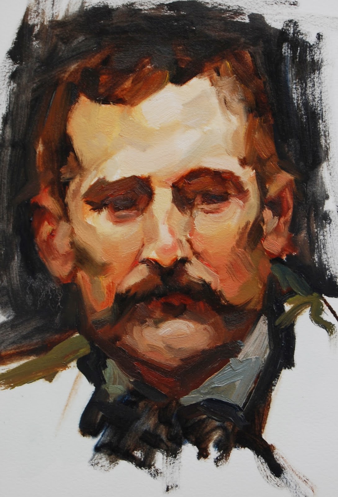
The point that stuck with me the most from my last crit was that color family bit.  For this study I tried to keep this in mind and not push the light-dark value range AND the warm-cool too much at the same time.  This was done from Sorolla's Portrait of Vicente Blasco Ibanez… In just two hours I may have added 10 pounds.


The values get a little lost in the beard, but the lights aren't bad.  The light note on the bridge of the nose is too light, too big, and has too hard of an edge.  The tones as the forehead turns towards shadow are too cool, as well as the dark green note of the beard in the light side.  His right lower lip has a touch of cool that makes me want to run for the oxygen tank, but the value is pretty close to correct.  I really like the cool notes as his stubble bends back toward his right ear; I wonder if they are warm enough?

Its funny to see these two studies juxtaposed; I wasn't thinking about any of this when I painted the red pump.  It makes big temperature jumps.  Did I keep the values close enough?

Stay tuned for results show.


Saturday, April 5, 2014

All in the Family

After drawing class Thursday morning, I was pumped and a little art-intoxicated as I lunched in the car en route to the dental office.  I was only able to attend 3 of about 12 classes during the first three month section, and poppin in for the last class I saw in the way of a time lapse how much everyone else improved!  It gave me hope!  And then gave me a swift kick in the pants.  


Sigh.
I was feeling left in the dust.
Thanks Mila the Cat for helping me feel through the blog this morning, perfect timing.
I have simply got to find a way to make more time for this… Working on it!

Regarding my last exercise, Benito round 4, Terry's crit commended some progress in realizing depth and awareness of the 'big sculpt', for which I was relived to hear.  The major issue with it was that I tried to push the depth a little too far and made the darks too dark.   Terry lays it out, "One of the fundamental rules of representational light and shadow relationships is that between light and shadow of a shared surface, you can have a big value jump or you can have a big color jump (temperature shift), but you can't have both."  So I made a big value jump but did not keep the light and shadow colors in the 'same hue family'.  I remember reading this excited to take it into the next study, and then I stepped back and looked at the result of that next study.  I may have done it again.  


Study of Sorolla's Santiago


(in progress)


About 1.5 hours later

The forehead is convincingly sculpted, but temporal shadow describing the left edge seems flat like a crack in the clock tower with the bit of light behind it too light and not falling back.  While the ears feel like they are pushed back, there is no feeling of side planes curving back to meet them and the nose is not popping.  So, this must mean the edges of the nose are too hard.  The eye sockets seem to have light on the upper lids where they should be in shadow.  In an attempt to redraw the mouth I got the darks too cool again!  From the in progress pic it looks like I started with barely a value difference between light and dark, and then I must have over compensated.  The shadow along his left side is a big value jump to the 'too dark side' and possibly too cool as well.  Sometimes I feel like I am taking a step back in results but there is definitely much more happening in my head!  This is definitely going to pay off!  Some day.

Wednesday, March 26, 2014

Edge Control & NO Time Limits!

Nothing strikes more fear into my heart than hearing, "I think we need to try one without the hour time limit…"  Sure I haven't beat the clock once, and yeah, its forced me to make choices faster than I can comfortably handle, but now there is no bell to save me!  How will I keep from overworking it and beating it to death?  How many times will I fix the wrong thing and wind up dragging new strokes over the terrain of the old dry ones like I am petting a cat the wrong way?  When will it end and how can it possibly end well?

Though the first line of his instructions had me panicked, Terry reassures me before signing off, "You may end up noodling and overworking, but let's not worry about that too much this round."  Ok, so thats a given, phew.  But between this promising to be exceptionally hard, and the first rounds of March Madness tipping off, I had more than enough fuel for procrastination.  Somehow I managed to grab the highlighter off of my NCAA bracket (I can't help but print it and grade it the old fashioned way) and review the keys to this assignment:


Edge Control

•Soft edges where the form turns
•Vary the softness depending on how quick the form turns; tighter radius = sharper edge
•Figure out stroke direction of foreshortened shapes (sharp edges are counter to foreshortening illusion)

Aslo Notable

•Paint light area physically on top of shadow
•Shadows should be subordinate to the light, less prominent
•Knock down the intense red of the underpainting w black or blue

And my favorite part

"Focus on creating hierarchy of depth from the tip of the nose to the background by paying more attention to edge control that you have ever done in your life!"

Good one Terry

This was really hard.  I have all kinds of room for growth in edge control.  I literally let this painting dry  several times and had to liquin back into it to continue working.  I am not sure that any of the last few hours really improved the situation either.  I mixed the brown and blue together to knock the red out of the underpainting, but the drawing was still to heavy handed.  A very bad sign when the assignment is edge control.  Isn't that essentially brush control?  Shouldn't the drawing be the easiest place to get that right?  Uhoh.

This time I made sure to keep the Assaro 'planes of the head' model near for reference.  The simplified head is very helpful in translating Sorolla's work, and easier to see than the small image in my book.  In all honesty, I didn't decide I was done because I stepped back and saw at last a superb product, but rather because it felt like I was beating a dead horse.  


Here is the iphone in-progress play by play


Thrown in the towel
Benito 4


Looks like the stroke describing the inside corner of his left eye cuts to far or to sharply into the iris- pretty wonky.  The dark wrinkle extending laterally from his left eye also seems too sharp.  The chin feels too flat, as well as the hair line.  I don't feel the recessed depth of the brow ridge either.  At least his nose feels like its popping out.  I feel like I have a long way to go on edges.  Maybe its time to put the head away for awhile and take out an orange!


Comparison of Benito 3 (from last assignment) & Benito 4


Here's to growth!


Friday, March 14, 2014

Comin' From Behind

"I'll give up the gym and dating!" 

Yep, my dramatic proclamation to Terry at our first meeting was a bit much.

(And then I met a boy!)

Coming from behind in more ways than one, I continue my pursuit of mastering fundamentals whilst simultaneously catching up on my study quota.  Luckily I prefer to act the underdog, the 12th seed over the 5th, rooting for the Bad News Bears.  And in this case climbing out from a significant master study deficit!  After an awesome surprise trip to Vegas with my amazing new boyfriend (Yay!), I have spent this past week recovering from a lack of sleep and checking boxes off my list.  The Golden Bear show came down with no bar casualties, and coincidentally made several happy new Lenefsky collectors.  Now, back to Sorolla heads!


The focus of these was to remember the head is first of all a head and not unlike an egg.  Before getting lost in the eyes or nose, the first goal is to depict the form which rounds both horizontally and vertically.  In the last few studies I was a hot mess.  Mistakes such as tripping over the texture of the paper, picking up way too much paint, pushing the brush too hard, and most costly, not mixing puddles or observing this value structure lead to flea ridden results.

I began the next few studies with a light Liquin coat, a medium to help smooth the flow of paint across the surface.  I also did not move past the drawing until I picked up my palate knife and made a pile each of light and shadow color.  I then attempted to stay focused and mixed all subsequent notes from either puddle in attempt to maintain the value structure.  


1hr Sorolla Study #10

Yep.  This is the third time I have painted this head!


Of my three Benito Perez Galdos efforts, this is the most successful.  I stuck with a bigger brush for a longer period of time and used a little medium in order to make fewer, larger passes.  Having premixed the puddles, this was also much easier to organize!   The light planes under his nose do not seem to compete with the forehead's lightest light as they did previously.  The ears however, are a bit Mr Potato Head-esq, sticking out with out falling back behind the face.  I lost the drawing and failed to define where they meet the side of head.  The nose seems like an umbrella, opening up over the philtrum and not rounding back down under the plane.  Still, finally looking better!


1hr Sorolla Study #11


For this study I referenced my full color Sorolla book and the plate Portrait of Jose Artal.  I'm feeling the volume of his forehead a bit here, but could have paid more attention to the brow ridge.   The light looks like a white box tattoo and doesn't describe the shape.   I am really not loving the nose here either,  as it is not convincingly sculpted.  The light notes in the beard are too light.  The puddles did seem to help with the organization, however I think I spent too much time on the wrong things.  Namely, in trying to describe the eyes in shadow, I reworked them several times to the detriment of the other features.  And in the last moments scrambled to fill in the flesh elsewhere.  

In round two of Jose, I closed the book and referenced a digital black and white image of the same painting along with my first Jose (#11).


1 hr Sorolla Studies #11 and #12


In terms of color I prefer Jose #12 overall, though the left side of his head does not round back into space as well.  Unfortunately, I managed to run out of time before he had a left ear but it seems roughly in at the right depth.  Hmm... can't wait to hear what Terry says!


Wednesday, February 26, 2014

Toning In!

I can see my high school basketball coach-slash favorite chemistry-teacher running us through the 'U' dance.  A ton of sprints signaled the start of every single practice, but up next was shot progression.   We'd cock our wrists back at 90 degrees and with the same bend of the elbow (forming the 'U') repeat the shot motion sans ball.  What discipline a bunch of high school girls had for such a basic drill!  It must have been our deep respect for the coach, or quite possibly the threat of more sprints, that kept us focused when all we wanted to do was play!

Yep, time for fundamentals.  

   Somehow I managed to glide over this part of my art education and jump right into heads!  In order to paint strong studies, or anything, one needs a distinct separation between the lights and darks.  This means a focus on tone and consistent value by making only subtle variations with in the respective light and dark sides.  For me in other words, not becoming so seduced by a color note that I disregard whether it belongs to the light or shadow.

Experiment #7 
(1 hour Sorolla study)
I thought perhaps using a very simple palate might be the way to go, so for this painting I used only Black (Ivory), White (Titanium), and Brown (Transparent Red Oxide).  My reference selection of a less obvious lighting scenario may not have been the easiest choice for this palate.  This was hard!  But then, they all seem quite hard!


For #8 and #9 I had the benefit of more direction from Terry.  I went back to my standard palate of White, Brown, Red (medium), Yellow (cadmium), and Blue (ultramarine), but varied the reference.  The first of these was done from an image in full color, while the second was done referencing that same image converted to black and white.  In this way I had an opportunity to bring my focus back to the value.  The second painting seems to have been more successful in describing the form of the brow, however most of the head is flat.  I forgot to refer not only to the black and white master painting, but to also use my previous painting to make better decisions.  I think I need another crack at this assignment.  Well, quite a few more cracks.


I am up way past my bedtime on a school night.  Yes!  I am grateful to have the morning off to attend a real Terry class tomorrow.  Off to sleep, wish me luck!

Sunday, February 23, 2014

A Major Award, Studies, and a Show

I won something!!  In honor of their Hockney exhibit the DeYoung hosted a Facebook contest.  As the artist had said, "I can't paint people I don't know," submissions were taken for portraits done of one's inner circle.  'Sara', the 11x14 of my amazing friend at the end of my first blog post was accepted and won!  Yay!  I tried to collect my prize, two VIP passes to the show and a catalog.  However, they announced it so close to the show's closing date that the show ended before they could get me the tickets!  They did graciously send me a very nice catalog, so it still feels like winning.  Thank you to all my friends who voted for me!


Sorolla reference for studies 4, 5, and 6!


 #4


#5 and #6
They were done on different days and they sure have distinct styles!   #4 needs the right side of his face defined more clearly, lost to the fleas again.  The last one done yesterday totally looks like a clown.  Must be the red nose and the lighter yellow notes under his lip.  (I am afraid of clowns!)  The oil paper is an absorbent surface and I am having a hard time getting paint to flow.  May use some medium again like I did in the earlier ones.  I really need to focus on the form and value and pay more attention!  #6 is out of control, though I probably wouldn't drag my hypothetical kid out of the birthday party this clown was working.  He has kind eyes.  Seems harmless.


While I was knocking out the first couple of those (#4 and #5) in late January, I got a call from a sweet midtown joint about hanging my art! 


You might recognize it from Dinners, Drive-Ins and Dives on the Food Network.  I was stoked but started to panic that there wasn't enough time to create a whole new body of work.  I was especially anxious as I had just jumped into home school with Terry, and knew it would set me back on that front.  Still, I had to say yes and call a time-out on the head studies to switch gears.  I managed to get a few new still life paintings done, barely in drying time, and up at the last minute with the extraordinary help of my friend.  (Sara again!  First she won me a contest and then this!).  It is up through March 7th if you can get by for a drink on the patio or a very awesome brunch!  
Here's a little taste.


Strapless 
8x8" oil on canvas panel
$200


You're Welcome 
6x6" oil on canvas panel
SOLD


 Slipper Kick
9x12" oil on canvas panel
SOLD


One more sample of the dozen!

Dad's Girl
11x14" oil on canvas panel
SOLD


When you have a show at a bar, at least one friend is going to come up with an outstanding idea.  Thank you Amy for the invention of the 'Lenefsky' autograph mustache.  There is always at least one more good reason for a Sharpie in your purse than you are currently privy too.  When you run out of 'SOLD's to write, there are always 'Lenefsky Stache's .


More action to come!


Saturday, February 22, 2014

1st Master Studies!


Picked up a music stand at the 5th String and a painting I love by Sorolla.  

The assignment: 

•1 hour on the timer
•gesture study (don't stress about drawing accuracy)
•do not copy, but in my own style
•not faster, but fewer strokes


Sorolla Study #1

One hour goes so fast!  I wish I could fix the highlight on her lower lip, it too big, but the timer is the authority!  This is a really fun assignment, Sorolla has done all the hard work and I just get to show up and play.  

Sorolla #2

Next stop in this book is an amazing selfie.  Yep, ran out of time.  His right eye could have used that upper lid stroked back in across it.  This 'Sorolla Tracking' is fascinating.  You really see so much more in a painting when you paint from it!  I love seeing the decisions he makes.  I think I did do decently on using the biggest brush for the job.  It is really easy for me to be seduced by the fleas!  That is paint the fleas before the dog.  I have lost a lot of dogs to the fleas...

Sorolla #3
Much cooler and grayer skin tones this time, reminds me of the Adam's Family.  Lower lip should extend past the edge of the nose, and that blue highlight is way too cool and too big.  I like the feel of it though!  Managed to keep things fairly simple.